Adding a mobile bottom navigation menu to your WordPress site can significantly improve the browsing experience for mobile users. Here is an optimized and corrected implementation suitable for modern WordPress themes.
1. Add CSS Styles
Add the following CSS code to the end of your theme's style.css file. This code defines the layout, appearance, and icons for the bottom navigation bar.
.mobile-bar {
position: fixed;
bottom: 0;
left: 0;
right: 0;
background: #FFF;
z-index: 9999;
border-top: 1px solid #e0e0e0;
width: 100%;
display: flex;
justify-content: space-around;
align-items: center;
box-shadow: 0 -2px 10px rgba(0, 0, 0, 0.1);
padding: 8px 0;
box-sizing: border-box;
}
.mobile-bar a {
cursor: pointer;
color: #5D656B;
display: flex;
flex-direction: column;
align-items: center;
text-decoration: none;
flex: 1;
transition: color 0.3s ease;
}
.mobile-bar a:hover {
color: #0073aa;
}
.mobile-bar a i {
display: block;
width: 24px;
height: 24px;
margin-bottom: 4px;
background-size: contain;
background-repeat: no-repeat;
background-position: center;
}
.mobile-bar a span {
display: block;
color: #333;
font-size: 12px;
line-height: 1.2;
}
/* Icon definitions - replace with your own paths or use a font icon library */
a.i-home i {
background-image: url('data:image/svg+xml;utf8,');
}
a.i-cat i {
background-image: url('data:image/svg+xml;utf8,');
}
a.i-my i {
background-image: url('data:image/svg+xml;utf8,');
}
a.i-buy i {
background-image: url('data:image/svg+xml;utf8,');
}
/* Example highlighted button style */
a.i-buy span {
color: #fff;
background-color: #ff5e5c;
padding: 4px 8px;
border-radius: 12px;
margin-top: 2px;
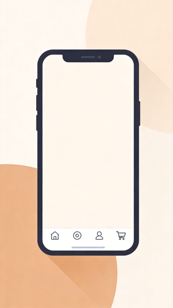
}2. Add HTML Structure
Add the following code to your theme's footer.php file, just before the closing </body> tag. We use a conditional check to ensure the navigation only displays on mobile devices and not on single post pages.
<?php if ( wp_is_mobile() && ! is_single() ) : ?>
<div class="mobile-bar">
    <a class="i-home" href="<?php echo esc_url( home_url( '/' ) ); ?>"><i></i><span>Home</span></a>
    <a class="i-cat" href="<?php echo esc_url( get_permalink( get_option( 'page_for_posts' ) ) ); ?>"><i></i><span>Categories</span></a>
    <a class="i-my" href="<?php echo esc_url( get_author_posts_url( get_current_user_id() ) ); ?>"><i></i><span>My Account</span></a>
    <a class="i-buy" href="<?php echo esc_url( wc_get_page_permalink( 'shop' ) ); ?>"><i></i><span>Shop</span></a>
</div>
<?php endif; ?>
3. Configuration and Customization
Modify Menu Items
- Text: Edit the text inside each
<span>tag, e.g., "Home", "Categories". - Links: Change the
hrefattribute value for each<a>tag. The example uses WordPress functions to get dynamic links; you can replace them with static URLs likehref="https://yourdomain.com/about/". - Icons: Icons are defined via
background-imagein the CSS. The example uses inline SVGs; you can replace them with your own icon file paths (e.g.,url('/wp-content/themes/your-theme/images/icon-home.png')) or use a font icon library like Font Awesome.
Advanced Adjustments
- Display Conditions: The condition
if ( wp_is_mobile() && ! is_single() )shows the bar only on mobile and not on single posts. Modify this, e.g., remove&& ! is_single()to show on all pages, or add other conditions. - Style Tweaks: Adjust colors, shadows, border-radius, spacing, etc., in the CSS to match your site's design.
- Performance: Consider using icon sprites or a font icon library to reduce HTTP requests.
Note: Before modifying theme files, always create a child theme or make backups to prevent losing custom code during updates. For complex needs, consider creating a plugin or using your theme's built-in menu functionality.